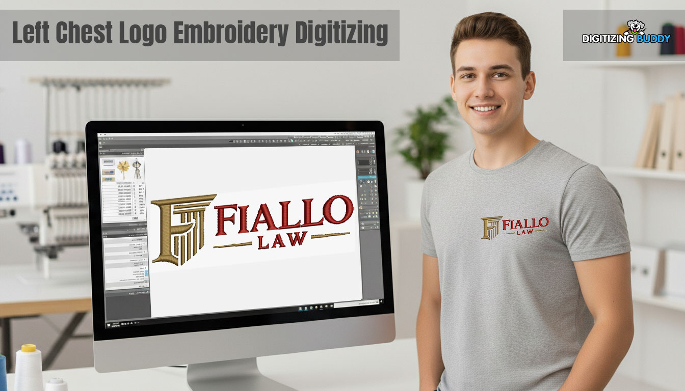
What Left Chest Logo Digitizing Means in Simple Terms
Digitizing Turns Artwork Into Stitch Files (PES, DST)
Left chest digitizing means converting your logo artwork into stitch instructions that an embroidery machine can understand. Instead of printing ink, the machine “reads” a file and stitches the design step by step. Common embroidery file formats include PES and DST. A digitized file tells the machine what stitch types to use, which direction to stitch, how dense the stitches should be, and the order the design should run.
What Left Chest Digitizing Means in Simple Terms
Digitizing Turns Artwork Into Stitch Files (PES, DST)
Left chest digitizing converts your logo artwork into stitch instructions an embroidery machine can follow. The machine does not “see” an image the way you do. It reads a file and stitches each element in a set order. Common formats include PES and DST. A good digitized file controls the stitch type, stitch direction, stitch density, and stitching sequence, so the logo runs cleanly and looks sharp.
Why Left Chest Logos Need Special Digitizing
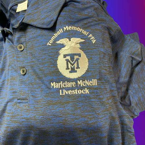
Left chest logos usually stitch at 3 to 4 inches wide, so the design packs into a tight space. That compression exposes problems fast. Tiny text loses clarity. Thin borders break or wobble. Too much stitching pulls the fabric and causes puckering, especially on polos. Strong left chest digitizing protects readability and keeps the design stable at a small size.
Where Left Chest Digitizing Is Used Most
Brands use left chest digitizing for uniforms, corporate apparel, and promotional clothing. These jobs often run in bulk, so you need consistency. The logo must stitch the same way across different sizes, fabrics, and production batches.
Standard Size Range and When to Use Each
Most Common Left Chest Widths
Most left chest logos are stitched between 2.5″ and 4″ wide. This range fits the chest area well and keeps the design looking balanced on polos, jackets, and uniforms.
The “Sweet Spot” Sizes
For most professional branding, 3.5″ to 4″ is the safest choice. It gives enough room for clean shapes and readable lettering. A smaller size like 2.5″ works best for simple logos, square icons, or designs with minimal text. It is also useful when the garment has limited space, such as small sizes or narrow chest panels.
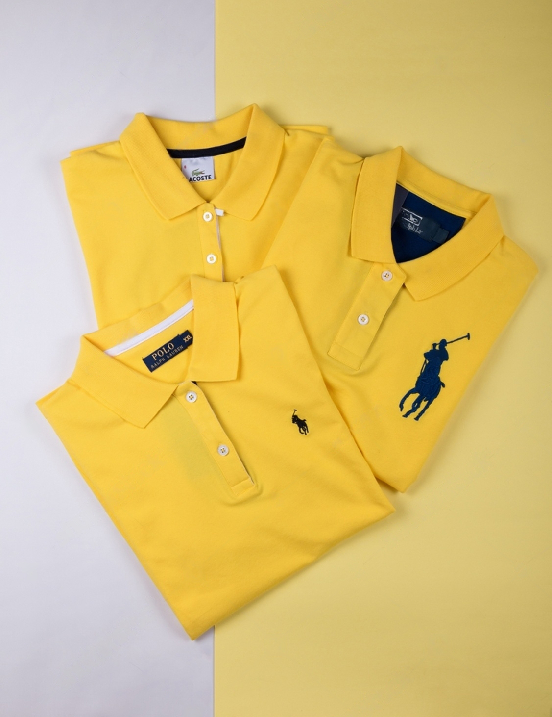
Why Small left chest logos are hard to digitize
Small logos can be more intricate than large designs. A classic example is the Ralph Lauren pony stitched at around 1.25 inches on the left chest. Other well-known small chest marks include the Lacoste crocodile, the Tommy Hilfiger flag, the Nike swoosh, the Adidas trefoil, and the small Polo crest-style badges used on premium polos. At that size, every stitch matters. Tiny curves, tight spacing, and thin borders can blur if the file is not built correctly. The same goes for small monograms like interlocking initials, three-letter monograms, or a compact “CK” / “TH” / “RL” style mark. Clean results come from smart simplification, solid underlay, controlled density, and stitch choices that keep the design sharp and readable on real fabric.
The Rule That Prevents Bad Results
Do not squeeze a complex logo into a small width just to match a standard size. When you force it, fine details get lost, and small text becomes hard to read after stitching.
Scaling the Right Way
Always scale based on the garment and the logo’s shape. A wide logo may need more width to stay readable, while a tall or square logo can look perfect at a smaller size.
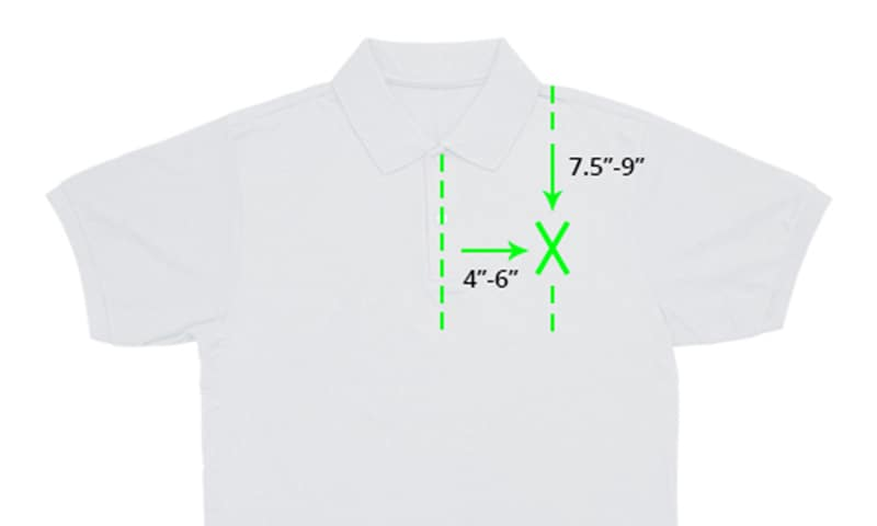
Placement Guidelines That Look Right on Men’s Shirts
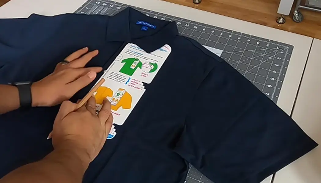
Use Reliable Measuring Points
To place a left chest logo neatly on men’s shirts, start with two simple reference points. Measure 7 to 9 inches down from the collar seam to set the vertical position. Then measure 4 to 6 inches to the wearer’s right from the center line to set the horizontal position. These ranges work well on polos, button-downs, and jackets because they keep the logo in the natural chest zone.
Why Placement Matters
Placement affects how the logo looks when the shirt is worn, not when it lies flat. If you push the design too far outward, it can drift toward the armpit area and look off-balance. It can also bend more with body movement, which makes small text and edges look worse.
Keep a Production Mindset
For bulk orders, use the same measuring method every time. Mark guides, use embroidery hoop gridlines, and repeat the same placement rules across sizes. Consistency protects the final look across the whole batch.
Artwork Prep Before Digitizing
Start With Clean, Sharp Artwork
Good digitizing starts with good input. Use a clean vector file when possible, because it gives smooth edges and clear shapes. If you do not have a vector, use a high-resolution image with crisp outlines and strong contrast. Blurry artwork forces guesswork, and guesswork shows up as ugly stitching.
Simplify for Small Left Chest Logos
A left chest logo is small, so you must prepare the art for embroidery, not for printing. Strengthen thin lines so they do not disappear. Close or remove tiny gaps that will stitch shut anyway. Reduce micro details that thread cannot hold at a 3–4 inch size. This keeps the logo readable instead of crowded.
Plan Colors Like a Production Job
Every color change means a stop. Limit unnecessary color breaks to speed up stitching and reduce trims. Keep shades consistent so the logo looks uniform across the batch.
Use the Right Tools
Digitizers typically build these files in software like Wilcom, Pulse, or Hatch. The software helps, but clean artwork and smart simplification do most of the heavy lifting.
The Core Technical Requirement: Low-Density Stitching to Prevent Puckering
Why Left Chest Needs More Control
Left chest embroidery sits on a moving part of the garment. The fabric bends with the body, stretches with breathing, and shifts inside the hoop if you rush setup. Because the design is small, even a little distortion becomes obvious. That is why you must control stitch density carefully.
What “Density” Means in Real Terms
Density is simply how much thread you pack into a space. If you push density too high, the logo turns stiff and heavy. The fabric cannot relax under the thread, so you start seeing ripples, pulls, and puckering around the edges. The logo may look raised, rough, and uncomfortable to wear.
Knits and Piqué Need a Lighter Touch
Piqué polos and other knit fabrics usually demand lower density than stable woven shirts. Knits stretch and rebound, so over-stitching fights the fabric and creates puckers faster.
Practical Takeaway
Aim for balance. Use enough stitching to cover the fabric cleanly, but not so much that the logo feels like a hard patch on the chest. A comfortable logo often looks better and lasts longer.
Underlay: The Foundation That Keeps Knits Stable
What Underlay Does
Underlay builds a base layer that supports your top stitches. It helps the logo hold shape, keeps edges crisp, and prevents stitches from sinking into the fabric.
Why Knits Need It More
Knits and piqué polos stretch and have texture. Without solid underlay, stitches can sink, outlines can wobble, and small details can lose definition.
Simple Rule to Follow
The less stable the fabric, the stronger the underlay should be. Stretchy, soft, or textured garments need more support than firm woven shirts.
Great top stitching cannot fix a weak foundation. If the underlay is wrong, the cleanest stitch work still looks unstable.
Stitch Types and Detail Management at 3–4 Inches
Use stitches that run clean at small letter sizes in left chest logo. Choose fills for larger areas so they cover smoothly and stay stable. Use satin where it truly helps, like borders, simple outlines, and some text.
Tiny text needs extra care. Satin lettering looks sharp only when the letters have enough height and thickness. When text gets too small, satin can break, round off, or merge letters together. In those cases, simplify the wording, slightly increase text size, or use a lighter stitch approach so the text stays readable after stitching.
The goal is simple: build a file optimized for smaller, high-detail designs. A design that stitches clearly at 3–4 inches matters more than one that only looks perfect on-screen.
Process Overview: From Upload to Stitch-Ready File
Testing and Setup: The Stitch-Out That Saves the Whole Job
Why a Test Run Matters
Left chest logos are small, so flaws show immediately. A quick test stitch-out helps you catch problems before you waste shirts, thread, and machine time.
What to Check on the Sample
Look at the logo up close. Confirm the text stays readable and small shapes do not fill in. Check edge quality so borders look smooth, not wavy. Watch for puckering around the design, especially on polos. Also inspect the back for extra trims and jumps, because too many can create a messy finish and increase thread breaks.
Setup Tips That Improve Results Fast
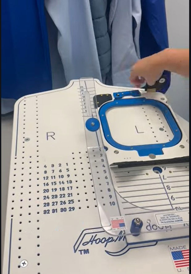
Use a sturdy backing to support the fabric, especially on knits and piqué polos. Then center the design accurately using hoops with gridlines or simple marking guides. Clean setup plus a test run prevents most production disasters.
Why Hire Professional Embroidery Digitizing Services
DIY digitizing can work for learning, testing, or personal projects where perfection is not critical. It helps you understand stitches, underlay, and how fabrics behave. But uniforms and client orders create a different kind of pressure. You need speed, consistency, and results that look right on the first run.
That is where the hidden costs start adding up. One weak file can waste garments, force multiple stitch-outs, and burn thread and stabilizer. You also lose machine time while you troubleshoot, and that can push jobs past deadlines. In production, delays often cost more than the digitizing fee.
A professional digitizer delivers a production-ready file built for your size and fabric. In many cases, that single clean run costs less than one failed attempt, especially when you include time, materials, and the risk of redoing the job.