
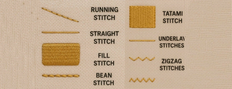
If you look closely at almost any machine embroidery design, you will see something simple. It uses just three stitch types. Run stitches create clean lines and fine details. Satin stitches form smooth borders and crisp lettering. Fill stitches cover larger areas, so the design looks solid and complete. Once you understand these three, you stop guessing. You start building designs with purpose, not trial and error.
In this guide, you will learn what each stitch does and where it works best. You will also learn how to choose the right stitch based on size, fabric, and placement like caps, left chest, or jackets. We will cover the mistakes that ruin sew-outs too. People often use satin where fill works better. They push density too high. They skip underlay and the design sinks into the fabric. These small choices decide whether your embroidery looks clean and professional or thick, puckered, and messy.
If you want to skip testing and wasted stitch-outs, hire a professional digitizing services. A pro sets it up right from the start. This helps most with small text, caps, and detailed logos.
Simple meaning of each stitch
Before you get into settings and stitch directions, it helps to understand what each stitch is meant to do. These three stitches act like basic tools. When you pick the right one, the design looks cleaner and stitches faster. When you pick the wrong one, you get gaps, messy edges, or heavy, stiff embroidery.
-
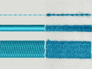
Run stitch = lines + light detail. Use it for thin outlines, small marks, and fine details where you want a clean “drawn” look. It can be a single line or repeated passes to make it stronger, but the main job stays the same: clean lines without bulk.
-
Satin stitch = smooth borders + lettering. Satin creates a polished, raised look, so it is perfect for borders, columns, and most text. It makes letters look sharp and professional, especially on left chest logos and patch-style designs.
-
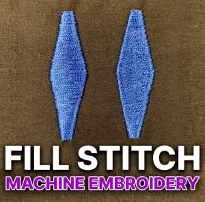
Fill stitch = solid coverage for larger areas. Fill covers wide shapes that would look messy or unstable with satin. It gives you even coverage across bigger sections of a logo, like a bold background shape, thick icon, or large lettering area.
Quick example: Most logos use a mix of all three. A small outline might use run, the text and border might use satin, and the larger shapes inside the logo usually use fill.
3) Run Stitch
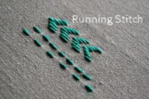
3.1 What it is
A run stitch is the most basic stitch in machine embroidery. It works like a pen line. The needle travels along a path and creates a simple line of stitches. You can digitize it as a single pass for light detail, or use multiple passes to make the line stronger and more visible.
3.2 Best uses
Run stitch works best when you need thin, clean lines without heavy coverage. It is commonly used for outlines, small facial details, whiskers, simple borders, and tiny marks that would look bulky in satin. Digitizers also use run stitches for guide lines and placement lines, and for sketch-style embroidery where the design intentionally looks like drawing.
3.3 Common run stitch problems
Run stitches can look weak if the fabric has texture or the line is too thin. On curves, you may see gaps because longer stitch lengths cannot follow the curve smoothly. Corners can also look messy or rounded if the path is not digitized cleanly. In fast production, run stitches may sink into the fabric and disappear, especially on thicker garments.
3.4 Quick fixes
If the line looks too light, switch from a single run to a double run, triple run, or bean stitch so the outline becomes bolder. For curves, reduce stitch length so the needle follows the curve smoothly and the line looks continuous. If you need a thicker, cleaner border or bold text-like edges, use satin instead of run because satin holds width better and looks more polished.
4) Satin Stitch
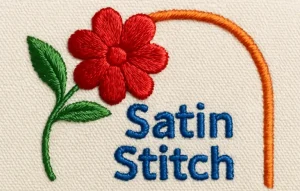
4.1 What it is
A satin stitch fills a narrow area using side-to-side stitches that run across the width of a shape. Think of it as a smooth “column” of thread. Because the stitches lay neatly next to each other, satin creates a shiny, raised, premium look that stands out more than a run stitch.
4.2 Best uses
Satin stitch works best for borders, lettering, and clean outlines where you want sharp edges. It is ideal for small shapes like badge outlines, thin bands, and simple icons. Most professional-looking logos use satin for text because it keeps letters crisp and easy to read, especially on left chest designs and caps.
4.3 Common satin stitch problems
Satin can cause pulling where the column narrows after stitching, making edges look uneven. You may also see gaps along the sides if the underlay is weak or the density is too low. On the other side, high density can lead to thread breaks and stiff embroidery. Satin can also create looping if tension is off, and long columns can turn into wavy lines if the fabric shifts during stitching.
4.4 Quick fixes
Start with proper underlay so the satin sits on a stable base and does not sink into the fabric. Keep density balanced. Too light shows gaps, too heavy causes breaks and stiffness. If the satin area gets too wide, do not force it. Split wide satin into smaller sections or switch that area to fill stitch for cleaner coverage and better stability.
6) Underlay: the hidden foundation
Underlay is the “base layer” of stitches that goes down before the top stitches. It does not exist to look pretty. It exists to hold the fabric, reduce shifting, and stop the top stitches from sinking into the material. Good underlay also improves coverage, makes edges cleaner, and adds a little lift so the design looks sharper and more premium after stitching.
Here are simple rules that work in most cases:
-
Satin usually needs edge-run + zigzag underlay. The edge-run helps define the borders and keeps the column clean. The zigzag gives the satin a stable bed so it does not tunnel, wobble, or show gaps along the edges. Without proper underlay, satin lettering and borders often look thin and uneven, even if the top stitch settings are “correct.”
-
Fill may need light to medium underlay based on fabric and coverage. On stable fabrics, a light underlay can be enough to support the fill and prevent sinking. On stretchy, textured, or unstable fabrics, you often need a stronger underlay to control movement and avoid puckering. The goal is always the same: support the fill without making the area too dense and stiff.
If your embroidery looks weak, bumpy, or misaligned, the problem is often not the top stitches. It is the underlay underneath them.
7) Quick decision guide: Which stitch should you choose?
When you feel stuck, come back to this simple rule: match the stitch to the job. Each stitch type has a “sweet spot,” and your design looks best when you stay in that zone.
-
Choose run stitch for thin detail and outlines. Use it for fine lines, small marks, and light detail work that should not look bulky. If the outline looks too weak, you can strengthen it with a double or triple run.
-
Choose satin stitch for borders and text. Satin gives you the cleanest, sharpest look for lettering and edges. It is perfect for logo text on left chest, patch borders, and smooth outlines that need to stand out.
-
Choose fill stitch for coverage and larger shapes. Fill handles wide areas better than satin. It gives solid coverage without the long, loose threads that can happen when satin gets too wide.
8) Common beginner mistakes (and how to avoid them)
Even with the right artwork, a few common mistakes can ruin the sew-out. Most of these problems come from choosing the wrong stitch type or forcing settings that look fine on screen but fail on fabric.
-
Using satin on wide areas. Satin looks great in narrow columns, but it becomes unstable when it gets too wide. Wide satin can snag, loop, and shift, and it often looks uneven after stitching. If an area is wide, split it into smaller satin sections or switch that area to a fill stitch.
-
Using fill for tiny text. Fill stitch is made for coverage, not for sharp edges. Tiny letters need clean borders and smooth surfaces, and fill usually makes them look thick and fuzzy. Use satin for most lettering, and use run stitch only for very small text when satin would be too bulky.
-
Too much density. Beginners often increase density to “make it look solid,” but that can backfire fast. High density makes embroidery stiff, causes puckering, and increases thread breaks. Keep density balanced, rely on correct underlay for coverage, and let the fabric breathe.
-
Ignoring fabric type and stabilization. The same design behaves differently on a cap, a polo, a hoodie, or a jacket. Stretchy or textured fabrics need better stabilization and smarter underlay. Always match the digitizing and stabilizer choice to the fabric and placement, or the design will shift and distort.
-
Judging only by software preview instead of a stitch-out. A perfect on-screen preview does not guarantee a clean sew-out. Different software can show the same file differently, and the real test is always the machine. Run a stitch-out on similar fabric, check the result, then adjust before production.
9) Hire a Professional Digitizer (and skip the trial-and-error)
Picking run, satin, or fill is simple. Making it sew clean on real fabric is the hard part. Small errors in density, underlay, pull compensation, and stitch direction cause most failures.
A professional digitizer matches stitches to fabric and placement (caps, polos, jackets, patches), builds proper underlay, controls push/pull so outlines stay aligned, and optimizes stitch order to reduce trims, jumps, and thread breaks.
Hiring is the smarter move for small text, detailed logos, realistic designs, bulk orders, and tight deadlines. For best results, send a vector (AI/EPS/PDF/SVG) or high-res PNG, plus the final size, fabric type, placement, and any must-keep details like tiny text or border thickness.
Conclusion
Run, satin, and fill stitches are the core building blocks of machine embroidery. Learn what each one does, and you will choose stitches faster and get cleaner results.
If you digitize yourself, always do a stitch-out test on similar fabric before production. If you want consistent, production-ready results without trial and error, hire a professional digitizer. Digitizing Buddy offers 24/7 live chat, rush service, and unlimited free edits. Get an instant free quote Now!